
Trends in multidimensional inequality & socio-demographic change in SA during 27 years of democracy
- Mar 8, 2022
- 62 min read
Updated: Aug 17, 2022

Copyright © 2022
Inclusive Society Institute
50 Long Street
Cape Town, 8000
South Africa
235-515 NPO
All rights reserved. No part of this publication may be reproduced or transmitted in any form
or by any means without the permission in writing from the Inclusive Society Institute.
DISCLAIMER
Views expressed in this report do not necessarily represent the views of the
Inclusive Society Institute or those of their respective Board or Council members.
Authors: Percept and 71point4
Editor: Daryl Swanepoel
7 February 2022
Executive summary
“What does inequality, poverty and socio-demographic change look like in South Africa – at present, and over the past 27 years of democracy?”
This report aims to address that question. To do so, we take a multidimensional approach to assessing inequality (as well as poverty and socio-demographic change), considering inequality in eight dimensions, namely: Economic, Education, Health, Living Conditions, Social and Cultural, Physical Security and Legal, Political, and Environmental.
For each of the dimensions, we review the literature and analyse data from various sources to provide a view at present, as well as over time.
Our approach moves one beyond referring to a Gini coefficient metric to answer the question of inequality. A shift towards a multidimensional framing of poverty and inequality in South Africa lends itself to a more comprehensive description of what has, and has not, been achieved during the new democratic dispensation. By interrogating the changes made in South Africa in a more granular way, the lived experience of South Africans may be better understood and reflected on. The approach also allows the drivers of inequality to be identified. In this way, levers of change and opportunity can be described, and poverty can be tackled more comprehensively.
Where useful, we rely on frameworks to consider how all of the mentioned dimensions link together. Some dimensions relate to ‘fundamental capabilities’ (like equal access to health, education, and economic participation). Others relate to ‘functionings’ (like health and education outcomes, and income and wealth). And yet others relate to ‘conversion factors’ (for example, personal, socio-political and environmental circumstances), where the latter may influence both capabilities and functionings.
Following the above approach, key summary points from each section (dimension) are:
Economic inequality: We analyse this in various ways, including by looking at income and wealth inequality, inequality in living standards, absolute levels of poverty, and employment statistics. This interrogation of the data follows others’ findings that the aggregate Gini coefficient has not changed significantly over time, which we also find to be the case. We further show that within-group racial inequality has increased, especially for Black African and Coloured individuals. In line with others’ findings, we find that most of the inequality is linked to the labour market: both extremely high unemployment and the distribution of wages drive most inequality in South Africa. There is no clear evidence that inequality has improved over time by taking a generational lens. The evidence on whether the inclusion of older generations (>65 years) in income inequality calculations lead to higher inequality is inconclusive. While population growth has been decreasing over the post-apartheid period, it is still higher than in comparable upper-middle-income countries. Population growth also manifests in household structure. Most South African households are extended family households, and these are also the poorest households on a per capita income basis. Single parent households follow with a low per capita income level, as such fertility rates (even though relatively low) may still not be at the desired level for South African women.
Inequality is lower among households with at least one person employed, but only marginally so (relative to the aggregate nationalpicture). Removing the top 1% of households (by income) also does not make a major difference to inequality. Absolute levels of poverty remain high. In 2015, 13.8 million people fell below the food poverty line; and in 2019, 11% of households reported that at least one person went hungry in the last 12 months.
Education inequality: We show that access to education and attendance has improved over time, at all levels. It has in some way reduced inequality in education, but there is still room for improvement. Despite this, the proportion of individuals that complete matric is low (less than half of those who start Grade 1 in a certain year matriculate successfully 12 years later), and this (lower levels of education) has serious implications for chances of employment, as the data show. Most concerning, however, is that the quality of (public) education remains low. It is evidenced by data on outcomes and infrastructure – which often points to the weak conversion of resources into learning outcomes as the main driver.
Health inequality: Like the picture on education, we see that access to health has increased over time, but that this has not translated into meaningful outcomes for beneficiaries due to poor quality of services. As with education, health also does not occur in a vacuum; many other socio-economic factors matter (outside of the health and education system) in working toward outcomes. Overall, health and education inequalities remain high, and follow socio-economic and racial lines.
Living conditions inequality: Like other resources, a clear socio-economic divide exists for housing access. Despite improvement in access to housing over time, including by means of subsidies from the government, many do not have adequate housing. For the 6.8 million households who reportedly have a monthly income of less than R3,500, 64% reported having inadequate housing – defined as informal or traditional houses, dwellings with no flush toilets, and households with more than two people per room. This picture improves slightly for those higher up in the income bracket, but improvement is mainly seen when the household income breaches R15,000 per month (generally the top fifth of households). Access to water, power and sanitation has improved over time, although there is still room for improvement.
Social and cultural inequality: While it is difficult to measure this accurately, we were able to elicit some notable findings. They show to which degree South Africans don’t interact with others who are different in some way, how many South Africans report feeling alienated, how factors such as gender link with poverty, and how South Africans perceive social cohesion to have changed over time.
Physical security and legal inequality: It is clear from evidence on these points that access to physical and legal security, and the impacts thereof, vary significantly by gender, age and geographical location. We discuss the concerningly high statistics of issues such as violence in this section.
Political inequality: Despite South Africa’s democratic system, the voices of individuals are not always heard. According to the data, many also perceive that they cannot discuss their political views freely, and at present, more than 8% of people feel that they cannot vote without feeling pressured.
Environmental inequality: In this final section, we discuss pollution and transport inequalities. Poorer people tend to be significantly more exposed to pollution, often because of residing closer to mines, refuse sites, sewage sites, and main transport roads. We also show the data on inequalities in access to different forms of transport. This indicates the high proportion of people whose mode of transport to health facilities is walking (possibly suggesting transport as a barrier in other areas of their lives, such as in accessing work opportunities).
Overall, we find that the picture of inequality in South Africa is deeply pervasive and entrenched, and it is difficult for many to truly access and participate in society and the economy, which would allow them a chance to improve their own and others’ well-being in their lifetimes.
Despite this, there are examples of progress that deserve to be highlighted. In the past 27 years, South Africa has, for example, expanded its welfare grant programme, housing programme, water and sanitation infrastructure, and access to schooling and healthcare, especially for the poorest and most vulnerable.
Unfortunately, the gains made are insufficient to improve the overall well-being of the majority of South Africans in a meaningful way. Grants are not enough to support recipients, housing and infrastructure programmes are not keeping pace with population growth and urbanisation, and the quality of basic services – including those relating to water, sanitation, health and education – are often suboptimal, resulting in inferior outcomes and services.
Content
Executive Summary
List of figures
List of tables
List of information boxes
Acronyms and abbreviations
1. Background and purpose
2. Conceptual framework – assessing multiple dimensions of inequality
3. Note on data sources
4. Inequality for whom?
5. Economic inequality
5.1 Overall income: inequality and poverty
5.2 Inequality in sources of income
5.3 Post-tax income inequality
5.4 Inequality in post-government expenditure (post-transfer) income
5.5 Inequality in Living Standards
5.6 Nutrition and hunger
5.7 Wealth
6. Education inequalities
6.1 Early Childhood Development
6.2 Basic Education
6.3 Tertiary Education
6.4 How does education link to employment and income?
7. Health inequalities
8. Inequalities in living conditions
8.1 Housing
8.2 Electricity, water and sanitation
8.3 Digital connectivity
9. Social and cultural inequalities
10. Physical security and legal inequalities
11. Political inequalities
12. Environmental inequalities
12.1 Pollution inequalities
12.2 Transport inequalities
13. Linking the many dimensions of inequality: Conclusion
References
List of figures
Figure 1: Framework for assessing multiple dimensions of inequality using a capability approach[2]
Figure 2: Growth in the number of individuals and households in South Africa, 2001-2019
Figure 3: Household sizes and differences in the measurement of income across household surveys, NIDS 2014/2015 vs. Living Conditions Survey (LCS 2014/2015)
Figure 4: Average annual percentage population growth, 1985 – 2020
Figure 5: Distribution of households by household structure type (total SA population)
Figure 6: Personal income tax contributions in 2018
Figure 7: Racial composition of post-tax income groups, 2019
Figure 8: Total individualised transfers received by pre-tax income group
Figure 9: Households' main income source by LSM group
Figure 10: Reported levels of household hunger (17.2m households)
Figure 11: Household wealth (Rand billion) according to data of the South African Reserve Bank (2020)
Figure 12: More accurate estimate of household wealth (2020, Rand Billion)
Figure 13: Residential properties on the deed's office registry by value
Figure 14: Linkages to the labour market and access to financial assets (wealth) through employment for the economically active
Figure 15: Educational attendance by age and reasons for non-attendance
Figure 16: Percentage distribution of education attainment for individuals 20 years and older, 2002-2018
Figure 17: Share of population by highest level of education and age group, 2020
Figure 18: Share of population aged 25-64 by highest level of education and race, 2010 and 2020
Figure 19: Demographic shift in young graduate (<35 years) profiles by race and gender between 2008 and 2020
Figure 20: Proportion of the unemployed by education level
Figure 21: Narrow rate of unemployment by highest level of education
Figure 22: Educational profile (highest level of education of the economically active population, by race
Figure 23: Relationship between highest level of education and unemployment rate for the economically active, by race (2021)
Figure 24: Narrow rate of unemployment for young graduates (2008-2020)
Figure 25: Means of transport to health facility by geographic location (total households=17.2m)
Figure 26: Reason for not using closest healthcare facility (by geographic location)
Figure 27: Medical scheme membership by race group
Figure 28: Number of households living in different types of housing, 2001-2019
Figure 29: Number of households living in different types of housing, 2015/2015
List of tables
Table 1: Mid-year population estimates 2021 by province
Table 2: South Africa's age distribution
Table 3: The Gini coefficient for the period 2007-2019 calculated from various data sources (tax and household surveys)
Table 4: Comparing the Gini coefficient for all households vs. households excluding the top 1% of income households
Table 5: Gini coefficient for individuals aged 65 and younger vs. individuals older than 65
Table 6: Inter-group Gini coefficient for those aged 65 and younger (excluding those aged older than 65)
Table 7: Median and average monthly per capita incomes of households, by household structure
Table 8: Gini coefficient for employed households, all individuals and all households
Table 9: Gini coefficients by population group for households with at least one member employed
Table 10: Number of registered taxpayers vs actual number of tax payments received, 2016-2020
Table 11: Afrobarometer responses about a survey on voting freedoms without pressure
Table 12: Different fuel sources used for cooking, by population group, 2003 & 2019
Table 13: Population groups' modes of transport to healthcare facilities
List of information boxes
Info Box 1: Impact of the COVID-19 pandemic on social grants
Info Box 2: Living Standards Measure
Info Box 3: Patient treatment journey
Info Box 4: Gugulethu street committee leader
Info Box 5: Pollution near coal mines
Acronyms and abbreviations
ECD Early Childhood Development
GBV Gender-Based Violence
GEMS Government Employee Medical Scheme
GHS General Household Survey
IES Income and Expenditure Survey
LASA Legal Aid South Africa
LCS Labour Conditions Survey
LSM Living Standard Measure
MDR-TB Multidrug Resistant Tuberculosis
NIDS National Income Dynamics Study
NIDS-CRAM National Income Dynamics Study – Coronavirus Rapid
Mobile Survey
OHS October Household Survey
QLFS Quarterly Labour Force Survey
SAARF South African Audience Research Foundation
SARS South African Revenue Service
StatsSA Statistics South Africa
TERS Temporary Relief Scheme
TIMSS Trends in International Mathematics and Science Study
1. Background and purpose
“‘Inequality’ has been likened to an elephant: you can’t define it,
but you know it when you see it.” (Fields, 2002)[1]
Almost three decades have passed since the fall of apartheid, and income inequality persists. Economic growth, equity and social cohesion in South Africa are generally considered poor or regressive despite considerable policy reform aimed at improving these outcomes. The media and political publications continue to place emphasis on income disparities using aggregate income inequality measures, such as the Gini coefficient. While important, this seemingly one-dimensional view of tracking progress post-1994 risks missing out on the dimensions of inequality that could become levers of change if properly understood.
Strides have been made in terms of achieving equity in access to services – particularly in the areas of education and health – and these should be acknowledged. At the same time, these strides have not translated into meaningful shifts in outcomes. It is therefore critical to understand the drivers of inequality to ensure that government policies and civil responses achieve the most optimal impact.
A shift towards a multidimensional framing of poverty and inequality in South Africa lends itself to a more comprehensive description of what has – and has not – been achieved during the new democratic dispensation. By interrogating the changes made in South Africa in a more granular way, the lived experience of South Africans may better be understood and reflected. The approach also allows the drivers of inequality to be identified. In this way, levers of change and opportunity can be described, and poverty can be tackled more comprehensively.
This report takes a deeper look at multiple dimensions of inequality and how it has changed in South Africa over the last 27 years. Priority pathways out of poverty and inequality traps are described in a separate report.
2. Conceptual framework - assessing multiple dimensions of inequality
We use various dimensions and metrics to describe and measure inequality. For the purpose of this report, we will be evaluating inequality based on the capability approach taken to the multidimensional inequality framework (explained later in the text) typically used in the broader Human Development context.[2] While the exact dimensions of any multidimensional framework can vary somewhat, we opted to interpret typical dimensions presented in the literature in a way that allows for more concrete analysis given limitations on data availability.
“Through the capability approach the Human Development approach redefines
the concept of well-being instead of on survival means.” (Bucelli and McKnight, 2021)[2]
Figure 1: Framework for assessing multiple dimensions of inequality using a capability approach[2]

The framework provides a systematic approach to evaluating eight dimensions of inequality, while emphasising the interconnection between all dimensions.[2] These interconnections are based on Sen’s capability approach. The capability approach distinguishes between conversion factors (drivers of multidimensional inequality), capabilities and functionings.[2] Conversion factors influence the degree to which advantage or disadvantage can move between the individual domains of inequality, some of these being capabilities (e.g. learning and education) and other functionings (outcomes – e.g. health). An environmental factor such as pollution is an example of a conversion factor that can drive the degree to which inequalities are transferred between domains – for example, from health to economic, if individuals are no longer able to work due to ill health because of pollution exposure.
The progress (or lack thereof) made in each dimension of the multidimensional inequality framework will be explored using a variety of metrics to provide a comprehensive understanding of inequality in South Africa.
3. Note on data sources
Our analysis makes use of various data sources (household surveys, public sector administrative data sources and private sector data sources) to ensure that our evaluation is as comprehensive as possible. Furthermore, this approach ensures robustness since each data source has its own strengths and weaknesses.
The underlying data used in this report and quoted in other reports is mainly derived from survey data sources. In some cases, it is possible to calculate income (personal, household and/or per capita income) from these surveys. However, incomes may be poorly reported in surveys – in some cases because respondents deliberately misstate their income and in others because incomes are inherently unstable and difficult to report on. For this reason, many researchers prefer to use expenditure data rather than income data for analysis. At the same time, the household unit itself is not well-defined or stable, which further complicates deriving per capita income measures.
4. Inequality for whom?
The starting point for any discussion on inequality is defining the population for whom inequality is being measured. An inequality assessment presupposes a distribution of resources relative to a given population within which the ranking of resources relative to individuals can be done. According to the 2019 General Household Survey (GHS), the most recent version of the survey for which data is available, there are 58.4 million people and 17.2 million households in South Africa. The number of households in South Africa grew at 2.4% per annum while the number of individuals grew at 1.5% per annum between 2001 and 2019. This discrepancy is driven to a large degree by the continued growth in one-person households, a phenomenon commonly associated with urbanisation, and in South Africa, with migration and employment patterns. The growth in households has clear implications for service delivery; an increase in the number of households implies a need for more dwellings, albeit smaller, and more infrastructure to service these dwellings appropriately.
Figure 2: Growth in the number of individuals and households in South Africa, 2001-2019
Sources: Census 2001, Community Survey 2007, Census 2011, Community Survey 2016, GHS 2019

Growth in population and households is also not evenly distributed across the country, with noticeably higher population growth in better-developed areas, as individuals migrate to access jobs, better-quality housing, education and healthcare. The latest mid-year population estimates published by Stats SA in July 2021 indicate that Gauteng has seen net in-migration of almost one million people between 2016 and 2021, with the Eastern Cape, Limpopo and Kwa-Zulu-Natal experiencing net out-migration of 320,000, 189,000 and 84,000 people respectively.
Table 1: 2021 mid-year population estimates by province
Source: Stats SA 2021

Recent statistics also show that 10% of the national population was aged 4 and under, 25% aged 12 and under, and 50% aged 26 and under (see Table 2 below).
Table 2: South Africa's age distribution
Source: NIDS Wave 5 (2017)

5. Economic inequality
When viewing inequality through a capability lens, income and wealth are not ends in themselves but serve as means to achieve welfare and freedom.[3] Because this report uses a multidimensional inequality framework underpinned by a capability approach, income and wealth inequality in South Africa is explored from the perspective that it contributes to suboptimal functionings among those at the bottom end of the distribution.
Income can be considered anything that makes consumption possible[4] and therefore, its sources are vast and varied. However, it is useful to categorise income according to its factor source (the factor of production used to generate the income): labour income (wages and salaries), capital income (capital gains and interest), income from entrepreneurship (profit) and land (rent). Understanding the dynamics and structural nature of the factor markets that generate these incomes is essential to figuring out the inequality story. Appreciating these complexities of factor markets also helps with accepting that income inequality is ‘sticky’ (slow changing).
Another important source of income in the South African context is transfers from the government in the form of social security grants. Spending on income grants and taxation are fiscal tools used by governments to improve distributive outcomes in the short term. One way to determine the impact of these direct interventions in reducing income inequality is by measuring primary (pre-tax and pre-government spending) income and comparing it to post-tax secondary income (post-tax and post-government spending). Although it’s more difficult to measure than income, we also consider the distribution of wealth in South Africa because of its potential to generate longer-term intergenerational benefits.
5.1 Overall income: inequality and poverty
South Africa has been labelled as one of the most unequal countries globally for decades. This is due to the strong focus placed on the Gini coefficient as the primary measure of inequality, which has remained persistently above 0.6.[5] The 2019 Stats SA inequality report[6] that reviewed progress in inequality reduction in post-apartheid South Africa arrived at the same conclusion. It revealed that there had been no substantial change in South Africa’s Gini coefficient during the post-apartheid period.
Even though the report[6] also considered non-income dimensions of inequality and numerous measures of inequality, South African media and political organisations focused exclusively on the aggregate Gini as a summary measure of inequality. Throughout this report, we will draw attention to improvements in inequality in other dimensions, where it exists. But ultimately income inequality – as measured by the Gini, in particular – remains the most widely reported and considered measure when assessing post-apartheid inequality.
Differences in both the reporting and consequently ultimate measurement of income reported by different households can make it difficult to accurately track income inequality. In the 2014/2015 Living Conditions Survey, one of the biggest household surveys in South Africa, 10% of households reported earning income of R30,000 or more per month. In the NIDS survey, a smaller panel survey conducted in the same period, only 6% of households reported earning income of R30,000 or more. Likewise, at the other end of the market, according to NIDS 2014/15, 38% of households earn less than R3,500 per month, compared to 41% as reported by the Living Conditions Survey. The Gini coefficient for these surveys is 0.6.
Figure 3: Household sizes and differences in the measurement of income across household surveys, NIDS 2014/2015 vs. Living Conditions Survey (LCS 2014/2015)
Sources: NIDS 2014-2015, Wave 4; LCS 2014-2015

Nevertheless, the reporting errors in and between surveys are typically not large enough to alter the pattern of extreme inequality shown by survey data. For example, while the NIDS, LCS, GHS and SARS tax statistics all provide markedly different estimates for the Gini coefficient, they leave no doubt that South Africa is characterised by extreme income inequality (Table 3). The Gini coefficient is lowest when administrative tax data is used (varying between 0.41 and 0.50 between 2007 and 2019). Data from the GHS shows Gini coefficients between 0.56 and 0.62, while the NIDS data (using a smaller sample) has Gini coefficients varying between 0.61 and 0.7. The LCS is not regularly repeated.
Table 3: The Gini coefficient for the period 2007-2019 calculated from various data sources (tax and household surveys)[1]

Some critical data sources, such as the Quarterly Labour Force Survey (QLFS), do not include sufficiently useful income measures (household income). Even where personal income data is collected from the respondent, this data is not disseminated publicly.
Where this is the case, the analysis uses other proxies to segment the market. Examples of these alternative proxies include Living Standard Measures (or LSMs, which themselves reflect key dimensions of inequality such as access to services), area or area type, race as well as education levels. The unit of analysis relative to which inequality is calculated varies throughout the report.
Excluding the top 1% from income inequality calculations only marginally reduces overall inequality. The contribution of the top 1% of the income distribution is a topic of global relevance and concern.7 Removing the top 1% of the income distribution’s income from calculations of the Gini coefficient can indicate to what extent overall income inequality is driven by the phenomenon of the “top 1%”, as the literature often refers to this group. As shown in Table 4, excluding this group’s income from the Gini only marginally decreases overall inequality. It generally lowers the Gini from 0.60 and above to just below, although using GHS income data lowers it to as low as 0.52 – which is still a very high level of inequality. Given that good data on the total population’s wealth is not accessible, this exercise was not repeated with wealth data.
Table 4: Comparing the Gini coefficient for all households vs. households excluding the top 1% of income households
Sources: NIDS and GHS

The evidence on whether the inclusion of older generations (>65 years) in income inequality calculations lead to higher inequality is inconclusive. Older generations have theoretically had more time to accumulate wealth from non-labour market income in the form of both financial and non-financial assets such as housing. However, different older population groups in South Africa would also have been more heavily subject to the inequalities generated by apartheid. Depending on the data source, the Gini coefficient for the population aged 65 and below can be higher or lower than the Gini coefficient for the population older than 65 years (Table 5). Data from the GHS generally shows a marginally lower trend in inequality for the population aged 65 and younger, while data from NIDS shows higher inequality among the population 65 and younger. The inter-group Gini coefficient for different South African race groups (Table 6) shows much higher inequality among Black and Coloured South Africans compared to White and Indian/Asian South Africans. Specifically for Black South Africans aged 65 years and younger, there also was a trend of increasing inequality in later years. Among Coloured South Africans, the inter-group Gini coefficient seems to have decreased between 2015 and 2019. This raises questions about which income distribution brackets within the group experienced increased or decreased incomes. Further investigation is required to answer this question.
Table 5: Gini coefficient for individuals aged 65 and younger vs. individuals older than 65
Sources: NIDS and GHS

Table 6: Inter-group Gini coefficient for those aged 65 and younger (excluding those aged older than 65)
Source: GHS

South Africa has experienced a population growth of between 1.2% and 2.3% over the past 36 years. The population growth rate has declined from an average of 2.2% per annum between 1985 and 1990 to an average of 1.2% per annum between 2015 and 2020. The country’s average population growth rate has typically been between the average of upper-middle-income countries’ growth rate and the lower-middle-income countries’ growth rate (Figure 4). Kenya, a comparator African country (but falling into the lower-middle-income category), has experienced a higher average population growth from 1985 to 2020, decreasing from 3.5% to 2.5%. All middle-income countries have experienced declining population growth rates over the period. This is likely due to the increased economic development of these countries and increasing access to education, family planning and other similar services.
Figure 4: Average annual percentage population growth, 1985-2020
Source: United Nations, Department of Economic and Social Affairs, Population Division, 2018

Population growth may play out in household structures (in an inequality context). Although fertility levels in South Africa (which contribute to decreasing average population growth rates) have been declining significantly, suggesting a strong fertility transition[8], average fertility may still be higher than women’s and households’ stated preferences.
Stats SA recently (2020) published nationwide research in which they asked women who had a baby in the five years preceding the survey (conducted in 2016) whether they wanted to get pregnant at the time. If they answered no, they were asked whether they wanted to rather have a baby later (indicating that the birth may have simply been unplanned or mistimed) or did not want more children (therefore indicating that the birth was unwanted). Unwanted births are therefore births – as recalled by the women surveyed – where no additional birth was planned or wanted at the time of conception. Over 20% of total births from the prior five years were classified as unwanted according to this research. The underlying research also shows that another 34% of the births were mistimed. As we discuss below, this may also have implications, especially for younger mothers. These unwanted births show a decline with increasing education; in 2016 unwanted births to mothers with tertiary education (11%) was four times less compared to mothers with no education (46.3%). 26% of the unwanted births were birthed into households in the poorest wealth quintile and 13% into households in the richest wealth quintile. The highest number of unwanted births were found in the Eastern Cape, followed by KwaZulu-Natal and Mpumalanga.[9]
Various factors may contribute to these high levels of unwanted fertility, including low-quality contraceptive services in the public sector, and gender violence and inequality. Recent research indicates that the unmet need for contraception remains high – at 19% – for sexually active women, and at 15% for married/in-union women. This research also highlights the widespread dissatisfaction by both community members and healthcare providers with the level of family planning quality of care.[10] We discuss gender-based violence later in this report under physical security and legal inequalities, where it is found that among adult women in South Africa, 21% have reported experiencing physical abuse in their lifetime.
While ideal population growth rates may be ambiguous and even controversial, the findings from stated preferences do provide insights into the possible links between population growth, poverty and inequality. The same report regarding unwanted births by Stats SA discusses that the disadvantages suffered by unwanted children may be in their health, early childhood development and potential future social and economic opportunities.[9] Similarly for parents (especially mothers), unwanted births may, dependent on the mother’s age at birth, limit one’s education, and job and income prospects, with possible knock-on effects for many other aspects that perpetuate inequalities. It is notable that there is also two-way directionality here (fertility influencing income and income influencing fertility), with other studies finding that higher education and income lead to lower fertility levels.[11]
Teenage births may have declined over time, but StatsSA shows that in 2020 alone, approximately 34,000 births were to women aged 17 and younger. These births are likely to cause education interruptions and later entry into the labour market. In the same year, it was found that more than 60% of all births were registered without the details of the father. This percentage may change alongside legislative changes and there may be many reasons for this phenomenon, including choices by individuals not to marry (until now prohibiting the father’s details to be included on the birth certificate).[12] Nevertheless, it does raise the question of the prevalence of single parents and what implications this may have for poverty and inequality.
In relation to inequality, population growth may indeed play out in household formation and different types of households’ average income and poverty levels.
Figure 5 sets out the distribution of different types of households in South Africa in 2015, with 39% of South Africans living in extended family and/or non-related households and 11.9% of households being single-parent family households. Extended family/non-related households typically have larger sizes than the other households. Table 7 sets out the income per capita of each household structure. The median per capita monthly income of the extended and/or non-related households is the lowest of all household structure types at R1,283 per month, followed by single-parent family households at R1,462 per capita per month.
Population growth which manifests in extended family/non-related households and in single-parent families (often female-headed) contributes to inequality in that these households typically share a limited set of resources among a large group of people, tend to be grant reliant, and these types of households typically don’t have good labour market links.[13] This type of household formation is both a result of poverty and inequality, as well as a contributor to future inequality.
Figure 5: Distribution of households by household structure type (total SA population)
Source: Living Conditions Survey 2015

Table 7: Median and average monthly per capita incomes of households, by household structure
Data source: Living Conditions Survey 2015

COVID-19 has worsened the economic situation and will affect poverty and inequality. Given the pre-pandemic South African context of weak, non-inclusive economic growth and high unemployment rates, it is expected that the economic effects of COVID-19 may perpetuate existing income inequalities and poverty. In some cases, it may even reverse economic gains made amongst vulnerable groups over the past two decades (e.g., women, the previously disadvantaged). Recent studies already point in this direction. Findings from the nationally representative NIDS-CRAMc survey provide robust evidence of sharp increases in household and child hunger and insufficient money for food during the COVID-19 pandemic, both of which remained disturbingly high from May 2020 to May 2021.14 When considering the impact of the COVID-19 crisis on the labour market - the source of labour income - gendered effects are already emerging. By March 2021, men’s employment and working hours reverted to pre-COVID levels but in contrast, women’s were below February 2020 baseline figures. Furthermore, inequalities in the time spent on childcare and in the income support for unemployed or furloughed workers endured during COVID-19.[15]
When Statistics South Africa upper-bound poverty line is used, more than one out every two South Africans were poor in 2015.[16] While there had been a clear decrease in poverty (using the upper-bound poverty line) between 2006 and 2011 from 66.6% to 53.2% of the population, by 2015 poverty had increased to 55.5% of the population.[16] This meant that 30.4 million South African were living in poverty in 2015. A similar poverty trends report has not been produced by Statistics South African since 2017 but the impact of COVID-19 is likely to have exacerbated the poverty situation by a large quantum.
5.2 Inequality in sources of income
Since the end of apartheid, a divergence between the top and bottom income deciles in real factor incomes (income generated through labour, capital, land or entrepreneurship) was seen.[17] The 13% increase in national income was largely due to a 30% increase among the highest decile, with an almost 50% increase seen in the top 1%.[17,18] In contrast, the average factor income has remained static in the middle 40% group, while the lower 50% has had a 30% drop.[17,18]
Economic growth since the 2000s has primarily resulted in an increase in income among the high-income earners.[17,18] Increases among the lower 90% have failed to rise substantially, and returned to levels observed in 1993 during 2011 (on the back of the global financial crisis). However, the top 10% was largely unaffected during 2011.[17,18]
Labour market income and large variation in labour market income play a very significant role in overall inequality. Work done by Stats SA and the French Development Agency found that roughly two-thirds of total inequality derives from inequality in labour market earnings and that half of this is related to the very high levels of unemployment in South Africa. The distribution of wage earnings among the employed also shows a long upper tail which increases overall inequality.
In this report, a simple exercise was done to determine the relationship between inequality and access to labour market earnings. Inequality is lower amongst households with at least one employed member, but only somewhat (see Table 8). Compared to data presented for the total population earlier in this report, inequality among households with at least one employed member is only marginally lower than for the total population. This could be because having only one employed member is an insufficient threshold, also given the high variation and longer upper tail described in the income distribution. Using household survey data that contains only household income data (as opposed to personal income) limits the analysis that can be done to households where at least one member is employed. If income is spread between many household members, this reduces per capita income, but total income would still be higher than in households without any employment.
The same pattern of lowest inequality within the groups of White and Indian/Asian South Africans hold here, with the highest inequality among Black and Coloured South Africans.
Table 8: Gini coefficient for employed households, all individuals and all households
Sources: GHS and NIDS

Table 9: Gini coefficients by population group for households with at least one member employed
Source: GHS

5.3 Post-tax income inequality
Personal income tax contributions, a large source of tax income that enables government expenditure, are paid primarily by wealthy South Africans because of the progressive nature of the tax regime. As illustrated in Figure 6 below, the top quartile of earners contributed 73% of the total personal income tax collected in 2018. In 2018, there were about 22.2m registered taxpayers. 19.1m tax payments were received (Table 10), although only 5.9m taxpayers were assessed.
Figure 6: Personal income tax contributions in 2018
Source: SARS data, 2018

Table 10: Number of registered taxpayers vs. actual number of tax payments received, 2016-2020
Source: SARS data, 2016-2020

Despite a progressive personal income taxation regimed and substantial changes in service delivery in the post-apartheid period as reviewed elsewhere in this report, racial inequality persists in South Africa. The White-to-Black income ratios remain high at 8 overall, and this divide is even greater when considering wealth.[17] A basic picture of the receipt of post-tax income by population share in 2019 is presented in Figure 7. In this figure, the population has been ranked by income from the lowest to the highest income receiving. After accounting for transfers and taxes, White South Africans account for a large proportion (50%) of the top 1%, indicating that they still receive far more income than their population share.[17,18] The slight reduction in racial inequality over the last two decadeshas largely been driven by the top 1% who are Black African.[18] The increase in incomes of Black South Africans falling in the top 1%and other higher-income groups have, however, increased within group inequality among Black South Africans.
Figure 7: Racial composition of post-tax income groups, 2019[18]

5.4 Inequality in post-government expenditure (post-transfer) income
Post-transfer income refers to income after government transfers (like social security) and expenditure on social services (education and health) have been taken into consideration. Measuring post-transfer incomes allows one to assess the impact of government transfers on primary income (pre-tax and pre government spending income), and whether it is progressive or regressive.
Figure 8 below shows the share of total transfers in grants, education and health that have been allocated to various income groups from 1993 to 2019.[18] It depicts the progressive changes made by the South African government: Individualised transfers as a proportion of the national income have consistently increased in favour of the poor.
There has been a relatively rapid growth in transfer income among the bottom 50% who received approximately 12% of the national income.[17,18] The middle income group also experienced an increase in transfers from 3.9% in 1993 to 5.3% in 2019.[17] This is compared to the 1% of national income received by the top 10%.[17] Overall, transfers have been made in the form of cash transfers or in-kind transfers.[17]
Figure 8: Total individualised transfers received by pre-tax income group[18]

Info Box 1: Impact of the COVID-19 pandemic on social grants The COVID-19 pandemic has been a driver of the rapid expansion of social grants in South Africa. This was due to the increase in unemployment. The recovery response indicated that R50 billion would be used to provide support to those who are vulnerable, along with the distribution of vouchers and food parcels.[15] The COVID-19 recovery response has resulted in the following grant adjustments or additions:[16]
R16.5 billion in relief was also provided to businesses in the form of debt holidays and financial support.[15] |
5.5 Inequality in Living Standards
It is possible to consider economic inequality in terms of more than just income. One can also view it in terms of what people choose to buy with their earnings – as well as their everyday living standards, as captured by a measure that not only takes income into account, but also assets and access to services. The South Africa Audience Research Foundation’s (SAARF) Living Standards Measure aims to do precisely this (see Info Box 2). In a way, it’s a multidimensional economic measure.
Info Box 2: Living Standards Measure In the 1980s, SAARF sought to construct a tool that could be used for market research.[17] Multiple variables were combined to create an index called the Living Standards Measure (LSM). This consisted of variables that were found to be strong indicators of living standards in South Africa based on the results of the AMPS survey.[17] These indicators could be used to segment the population into 10 LSM groups.[17] After multiple iterations of the LSM, 20 indicators were incorporated in 2001.[17] These evaluated whether households have the following: a built-in kitchen sink, car, flush toilets, shopping at supermarkets, microwaves, credit cards, fridge, washing machine, financial services, hut, stove, polisher, insurance policy, Hi-Fi, video cassette recorder, domestic worker, TV, car, hot running water and telephone.[17] The list of relevant assets has been updated with time as certain assets have lost their economic and functional significance. Each variable has a positive or negative weighting used to determine the final index.[17] |
The 2014-2019 period saw households from the LSMs 6 and 7 become more reliant on grants and remittances as their main sources of income. Households in the highest LSMs rely largely on income through salaries, business profits and pensions, and the latter two have become more prominent in the past five years. More than 25% of households at LSM 5 and lower rely on grants as their main source of income. Remittances also play an important role for households in the lower LSMs (approximately 15% of these households’ main source of income), particularly in more recent years.
Figure 9: Households' main income source by LSM group
Source: SAARF

5.6 Nutrition and hunger
Hunger is a sign of insufficient income to sustain good nutritional levels. It is closely linked to income, wealth and living standards. However, we treat it separately here, given its importance as an indicator of insufficient means to sustain a basic human need. In the latest General Household Survey (2019), 11% of all South African households reported at least one person going hungry in the past 12 months. 6% of households reported sometimes going hungry, while 2% said they often go hungry. These percentages are much higher for Black South African households, where 12% of households reported at least one person going hungry in the past twelve months, compared to less than 1% of White South African households. Hunger levels in South African households were exacerbated by the COVID-19 pandemic and associated lockdown measures, which prevented many households from obtaining an income and ultimately, necessary levels of nutrition.[14]
Figure 10: Reported levels of household hunger (17.2m households)
Sources: GHS 2019

5.7 Wealth
Inequality is often calculated using income rather than wealth data, given the complications of accessing wealth data. Recent work by Chatterjee et al.[19] however takes a quite novel approach, using alternative data sources such as tax data. In this study, the wealth-to-national-income ratio provides some context regarding wealth inequality.
The South African wealth-to-national-income ratio has remained relatively stable between 2.5 and 2.8 following the end of apartheid.[19] However, the average wealth of individuals has fluctuated over time. Before the early 2000s, the real average wealth per adult stagnated at around R240,000 per person. It then rapidly increased by about 30%, before stabilising at R320,000 after the 2008 financial crisis.[19]
Wealth is extremely unequally distributed. The top 1% of the population by wealth own 55% of wealth assets, while the bottom 50% have a negative net worth due to their liabilities exceeding their assets.
Age appears to correlate strongly with wealth accumulation in South Africa. The average net worth of individuals increases linearly until age 55. Adults aged 50-55 are approximately 50% more wealthy than the national average. Following this, wealth generally plateaus. In each age group, the top 10% holds the majority of wealth (approximately 85%). It indicates that generational wealth plays a role in wealth accumulation over time.[19]
A 2018 review showed that in 2018, financial and non-financial assets respectively amounted to two years and one year of national income. Pension assets represented the biggest component of financial assets (73% of national income), closely followed by equities and fund shares (51%), bonds and interest deposits (45%), and life insurance assets (35%).[19] Figure 11 indicates that this trend has remained consistent over time. Housing is the main driver of individual and household non-financial wealth today.[20] In 2020, residential property amounted to R3,061billion (25%) of household wealth according to official data of the South African Reserve Bank. However, this is likely a gross underestimation. Housing may account for up to R5,500 billion in household wealth, if theassumptions on the average values of houses are adjusted using data from the Centre for Affordable Housing (Figure 12). This adjustment would make housing the biggest source of wealth in South Africa.
Figure 11: Household wealth (Rand billion) according to data of the South African Reserve Bank (2020)
Source: SARB Quarterly Bulletin, June 2021

Figure 12: More accurate estimate of household wealth (2020, Rand Billion)
Source: SARB Quarterly Bulletin, June 2021

The number of households living in formal housing increased by 6.3 million between 2001 and 2019 and is estimated to be around 14 million. While 14 million households live in what appear to be formal structures, there are only 6.6 million registered residential properties on the Deeds Office registry. 18% are valued at under R600,000, comprising a fifth of the value of residential property. The undervaluation of property, and in effect, underestimating the owner’s contribution to wealth, is likely to be a particular issue in the R600,000-or-less property category. [21–23]
Figure 13: Residential properties on the Deeds Office’s registry – by value
Source: City Mark data compiled by the Centre for Affordable Housing Finance in Africa (CAHF)

Financial assets are generally tied to formal employment and employment benefits such as pensions accessed through this type of employment. By the first quarter of 2021, only 14.5m of economically active people in South Africa were employed, of which 10.5m were formally employed. Unemployed workers, using the broad definition, constituted 10.4m, of which 3.1m were discouraged work-seekers. This means that out of a total base population of 24.9m economically active South Africans, 10.4m were unemployed, implying about four out of every 10 economically active South Africans were unemployed. COVID-19 and the associated lockdowns resulted in very large employment losses and a large growth in discouraged workers. However, between the first quarter of 2021 and the second quarter of the same year, there was a reduction in discouraged workers, reflecting the recovery of the post-lockdown economy.[24] Only 5.9m of formal sector workers had access to permanent employment which provided them with paid leave and access to some type of pension that would enable the accumulation of assets for retirement.
Figure 14: Linkages to the labour market and access to financial assets (wealth) through employment for the economically active
Source: QLFS 2021 Q1

6. Education inequalities
In this section, we show that access to education has improved over time. It has gone some way to reduce inequality in education, but there is still room for improvement. Despite this, the proportion of individuals who complete matric is low, which has implications for employment. Most concerning however, is that the quality of (public) education remains low. Education does not occur in a vacuum and the broader socio-economic context in which a child is raised matters greatly. Below, we describe key indicators regarding the education system at different levels, before turning to the link between education and employment (income).
6.1 Early Childhood Development
Education begins with early childhood development (ECD), which may be split into community-based ECD for children 0-4 years old, and Grade R, aimed at children 5-6 years old. Despite the fact that ECD centres receive subsidies from the government, access to this type of education is affected by parents’ ability to afford ECD programmes.[25] There are significant differences in the rates of access to ECD by race in South Africa. While 47% of young White children were not enrolled in ECD programmes, 63% of Black African young children were not enrolled. The percentage of non-enrolment is highest for Coloured children – at 72%. The cost of early childhood education as a barrier to access is more frequently reported as an issue by Coloured (5%) and Black African (14%) households than White households (3%).
Nevertheless, in most cases, it is the choice of the parent or guardian not to send their child to an ECD centre.[21] On the supply side, studies point to the fact that ECD teachers are poorly paid, which affects the quality of personnel in ECD centres. Many centres also lack basic infrastructure. A 2013 ECD audit showed that 20% of national ECD centres lack adequate water, 25% lack adequate electricity, 26% lack adequate toilets, and 57% are overcrowded. Despite this, there have been improvements in ECD over time, with enrolment in Grade R more than doubling between 2003 and 2013 (300,000 to 779,370 students). This has implications for later education, with research showing that attendance of Grade R significantly elevates learning for the remainder of the child’s education. It is however mainly the case in higher quintile schools, with lower quintile schools showing no indication of benefits. Researchers suggest that this is due to differing quality of interventions.[26]
6.2 Basic Education
Data from the GHS show high levels of school attendance across all ages, with a sharp drop-off from the age of 15 onwards. South African children are legally allowed to stop school attendance from the age of 15. By the age of 18, more than 70% of children are still attending school (see Figure 15). For those not attending, financial constraints and being too old or too young are most reported as reasons.
Figure 15: Educational attendance by age and reasons for non-attendance
Source: GHS 2019[21]

The above picture of school attendance and completion across different levels has improved over time, as shown in Figure 16 below. This shows that the percentage of individuals aged 20 years and older who have attained at least Grade 12 has also been increasing consistently since 2002, growing from 30% in 2002 to approximately 45% in 2018 (seen by adding up the top elements in each bar). The percentage of individuals without any schooling decreased from 11% in 2002 to 5% in 2018.
Figure 16: Percentage distribution of education attainment for individuals 20 years and older, 2002-2018
Source: GHS 201821

Figure 17 below shows the share of adults in South Africa by their highest level of education, broken down by age group. This again shows the positive shift that has occurred over an even longer time frame. 7% of those currently aged 55-64 report having had no schooling. This has dropped but is not eliminated. Of those currently aged 25-34 years, less than 1% report having no schooling. A similar trend shows for those with less than primary schooling. 19% of current 55-64-year-olds report having had less than primary schooling, while 3% of those currently aged 25-34 report the same. Overall, this picture shows that people are increasingly attaining higher levels of education, with significantly more people reaching and completing secondary school.
Figure 17: Share of population by highest level of education and age group, 2020
Source: QLFS 2020 (2021)[27]

Figure 18 below looks at the same QLFS data, comparing 2010 and 2020 data for adults (25-64 years old), but breaks this down by race. Black African and Coloured groups had the largest proportions of persons who have had some secondary schooling as their highest level of education. Meanwhile, the largest proportions of Indian/Asian and White people had secondary education (completed) as their highest level of education. This picture has improved over time, however to a large extent the inequalities persist.
Figure 18: Share of population aged 25-64 by highest level of education and race, 2010 and 2020
Source: QLFS 2010 and 2020[27]

Despite the above improvements, many still stop schooling before matric. 44% of the “class of 2017” successfully matriculated in the standard time, meaning that of the cohort of individuals who started Grade 1 in 2006, 44% completed matric in 2017. Various studies indicate similar outcomes, stating that of a cohort of students entering Grade 1, on average 60% of students reach Grade 12 within twelve years of schooling, 50% pass Grade 12, 14% attend university and 6% obtain a degree.[28,29]
While the above focuses on education items such as educational attendance and shows some sign of improvement, the quality of education remains the greatest concern. Not all schools provide a similar quality of education and there are still distinctions in this that follow racial lines. The GHS of 2019[21] shows that 69% of White students attend private (independent) schools and the remaining 31% of White students attend public (government) schools. 94% of Black African students attend public (government) schools and the remaining 6% attend private (independent) schools. The quality of teaching is often challenging for teachers in public schools and most educators report that they lack sufficient training and have very large classes, making it difficult to teach. Absenteeism has also been a downfall for both teachers and students as a result of poor access to transport.[28]
Despite international Minimum Norms and Standards for educational facilities, public schools still lack basic infrastructure. Approximately 19% of public schools have pit latrines, 77% of schools do not have a library, 72% lack internet access, and 42% do not have sporting facilities.[28] This has hindered educators’ ability to teach.[28] Inequalities are also highlighted by differences in test scores (education outcomes). Provinces such as Limpopo and the Eastern Cape have high rates of illiteracy, with 91% and 85% of children still being illiterate at age 9 years. This is compared to a national average of 75%.[28] Other studies show that the percentage of Grade 9s that perform above the low international benchmark of 400 in TIMSS (Trends in International Mathematics and Science Study) is around 16-19% for public no-fee schools, 58-60% for public fee-paying schools, and 81% for independent (private) schools.[26]
Public resources for school education have been reallocated to the extent that the racial and rich-poor gaps in public spending per child have largely been eliminated, although wealthier urban schools still have more highly qualified teachers, and therefore better-remunerated teachers, and fee-paying schools can supplement public resources through their school fees. Resource shifts have not eliminated infrastructural backlogs in education, but in most cases, they have also not fundamentally changed learning outcomes, because of weak conversion of resources to learning outcomes in much of the school system. In contrast to the above concerns, signs of quality improvement and consequent inequality reduction do exist. For example, analysis of matric performance for 2002, 2009 and 2016 show that the number of non-White students attaining a level of mathematics performance that would allow entry into engineering at university increased by 65%. These improvements occurred inter alia through the expansion of good mathematics performance across rural schools.[26]
6.3 Tertiary Education
Despite the challenges mentioned above, higher education enrolment and completion has increased in the post-apartheid period, as already shown in some of the figures above. Figure 19 also shows the distribution of young graduates (degrees) by race, indicating improvement in this overall picture to align more closely with population demographics.
Figure 19: Demographic shift in young graduate (<35 years) profiles by race and gender between 2008 and 2020
Source: QLFS 2008 Q1-Q4 and 2020 Q1-Q4[27] (data averaged within each year)

In 2019, approximately 1.15 million students were enrolled in universities (953,000 public and 197,000 private), 880,000 in TVET colleges (710,000 public and 170,000 private), and 300,000 in community education and training centres.[30]
6.4 How does education link to employment and income?
Figure 20 below shows that of the 6.7 million unemployed persons at the end of 2019, 56% had education levels below matric, followed by those with matric at 34.7%. Only 1.9% of the unemployed persons were graduates, while 6.8% had other tertiary qualifications as their highest level of education. This suggests that lower levels of education are associated with higher levels of unemployment.
Figure 20: Proportion of the unemployed by education level
Source: QLFS Q4, 2019[27]

Figure 21 below shows the (narrow) unemployment rate for individuals of different educational profiles (highest level of education). This again shows that the unemployment rate is highest for those with lower levels of education. It also shows a consistent upward trend across education levels, meaning that having lower levels of education is increasingly associated with unemployment. It also highlights a significant increase in unemployment for all education levels, which is a concerning trend.
Figure 21: Narrow rate of unemployment by highest level of education
Source: QLFS 2008 Q1-2020 Q4[27]

The educational profile of the economically active population (those employed or actively searching for employment) still differs significantly by race. Figure 22 below shows that almost 92% of economically active White South Africans have a matric qualification (43% + 23% + 25%, rounded) while approximately 51% of economically active Black African individuals have a matric qualification (34% + 12% + 5%, rounded).
Figure 22: Educational profile (highest level of education of the economically active population, by race)
Source: QLFS 2021 (Q1)[27]

Figure 23 below shows the economically active population, split by highest educational level (x-axis) and race (y-axis), as well as absolute numbers (size of each circle) and percentage within each circle that are employed and unemployed. This shows that most of the economically active population is represented by Black African individuals with some high school or matric, but that for each of these groups, the rate of unemployment is also highest (42% of 39% respectively).
Figure 23: Relationship between the highest level of education and the unemployment rate for the economically active, by race (2021)
Source: QLFS 2021 (Q1)[27] (data for economically active only, based on expanded definition; data for those who have only completed primary school not shown)

Figure 24 below also shows that even within the upper echelons of the labour force, those with a tertiary degree – Black African females, followed by Black African males – still experience the highest levels of unemployment. There may be many reasons for this, including the difference in the quality of education received by individuals, even within similar levels of education.
Figure 24: Narrow rate of unemployment for young graduates (2008-2020)
Source: QLFS 2008 Q1-2020 Q4[27] (data averaged over each year)

7. Health inequalities
It’s important to understand health inequalities because of their direct bearing on people’s individual quality of life (being healthy or not) – and the spill-overs of its (dis)advantages to other domains of inequality.[2] This is more readily appreciated when one considers that in addition to the initial distribution of health entitlements and endowments, the key drivers of health inequality cut across multiple conversion factors: personal conversion factors (for example, age and gender), socio-political conversion factors (for example, stigma and institutions), and environmental conversion factors (for example, pollution and overcrowding)[31]. Collectively, these factors determine the extent to which dis(advantages) of health inequalities spill over into other domains, such as income inequality.
Decades of systematic discrimination under apartheid – a key socio-political conversion factor in the South African context – left a legacy of health inequalities. What remains is a two-tiered health system: a private health sector that services those who can afford it, and a public health sector that services the majority who cannot afford private healthcare. Although the post-apartheid government made strides in increasing access to public healthcare,[32] access gaps remain[33] and the quality of the services provided is not on par with the private sector.[34–36] It is therefore unsurprising that poor health outcomes persist in South Africa, especially among the most vulnerable.[37,38]
Before describing the more recent state of health inequalities in South Africa, it is important to reflect on the progress made since the end of apartheid. Since 1994, the South African government prioritised healthcare reform on its development agenda.[32] Improvements in the progressive spending of public healthcare were observed between 1995 and 2008.[39] In 1995, spending on public hospitals was pro-rich and only weakly redistributive for public clinics, but by 2008, spending on both public clinics and hospitals was pro-poor. Indicated by data from the 1995 IES/OHS and the 2008 NIDS, the utilisation of public health facilities increased dramatically over this period (1998-2005) for the poorest 20% of South Africans.[39] Additionally, government healthcare spending on the poorest 20% of the population increased from around 20% in 1995 to around 30% in 2008.[39]The government also increased access to healthcare for the poorest and most marginalised groups of society by expanding the healthcare facility network and abolishing user fees at the primary healthcare level.[32] The success of government interventions to redress financial and physical access to healthcare was also reflected in the low incidence of catastrophic costs and reduced travel time between 1993 and 2008.[39]
Despite the post-1994 successes with increasing financial and physical access to care, room for improvement remains. Proxies of access to care vary significantly. In 2019, high rates of immunisation (83.5%) and availability of hospital beds (96.3%) demonstrated that there was adequate coverage of these parameters in South Africa.[33] However, the rates of antiretroviral effective coverage (42.5%), diabetes treatment care (37.9%) and health worker density (15.2%) remained low.[33] In addition to accessing a healthcare facility, the South African government set an 80% benchmark for the availability of medication in each facility.[40] In 2019/2020,[41] medication availability ranged from 78.2% to 93.7%, with a national average of 87.7%.[41] Despite an increase from the 2018 average of 84.7%, two provinces experienced medication shortages below the threshold: Limpopo (78.2%) and the Western Cape (79.9%). The North West also came in on the margin at 80.5%.[41]
When it comes to decomposing inequalities in healthcare access by a geographical location, access to healthcare facilities shows a geographical bias, as demonstrated in Figure 25 below, which was generated using 2019 GHS data. Even though walking to a healthcare facility is the most common means of transport for most households (approximately half in both rural and urban areas), rural households use taxis to access care at double the rate of urban households (40% vs. 20%). Using taxis has cost implications, which may present barriers to early care-seeking. It is also interesting to note that using a bus to access care performs poorly in both relative and absolute terms: it ranks the lowest in terms of means of transport when compared to other modes, and its reported use is low (0-2%), irrespective of geographical location. These findings may allude to weak and/or unreliable public transport systems and highlight how environmental conversion factors may perpetuate or alleviate health inequalities.
Figure 25: Means of transport to health facility by geographic location (total households: 17.2m)
Source: GHS 2019

The geographical bias in access to care also emerges when analysing travel times to health facilities. While just over one in two households in urban areas reported travel times to healthcare facilities in less than 15 minutes in 2019, only one in five households could report the same in rural areas (see Figure 25 above). In rural areas, almost 80% of households take from 15 to 89 minutes to travel to a facility, while only about half of urban households reported the same travel time.
Even if care is accessed and received, it is important to ensure that quality standards are upheld. The government implemented an Ideal Clinic benchmark for clinics in 2015 and only 9.2% of clinics achieved this status at the time.[41] It improved to 55.4% in 2018, but decreased slightly to 54.9% in 2019, indicating the challenge to ensure the sustainability of quality assurance initiatives. [41] Basic patient-centric conduct may improve the perceived quality of care by patients. These include being greeted by staff and having their condition adequately explained to them.[36] When simulated (mystery) pre-hypertensive patients were used in a study assessing the quality of care at primary healthcare facilities in South Africa, the latter was poorly performed. Among these standardised patients, 39% received no lifestyle counselling, and 25% did not receive a diagnosis or follow-up appointment.[35] Similarly, among standardised TB patients, only 43% were offered an HIV test and 54% did not have any contact tracing.[34] It is inevitable that demand-side proxies for poor healthcare quality, such as bad experiences or negative perceptions of healthcare services, will negatively impact health-seeking behaviours.
More evidence of how client experiences at healthcare services feed into health-seeking behaviour is illustrated in Figure 26 below. According to GHS data, in 2019 the main reasons why households reported bypassing their closest healthcare facility was based on their preference for private healthcare, long waiting times and a lack of required medication. Although the reported proportion was almost twice as high in urban areas as in rural areas (46% vs. 23%), the preference for private healthcare ranked as the top reason for bypassing, irrespective of the household’s geographical location. This finding has financial implications for the poor, who need to pay out of pocket for private healthcare – and are prepared to do so, even when ‘free’ public healthcare is available.
Figure 26: Reason for not using closest healthcare facility (by geographic location)
Source: GHS 2019

Info Box 3: Patient treatment journey Below we present an excerpt from an article that documents the treatment journey of a 35-year-old woman who was co-infected with MDR-TB and HIV and started treatment in early 2009. She was a single parent with three young children, living in a rural location 35 km from the decentralised MDR-TB hospital. ‘In summary, for more than half (58%) of this patient’s 24-month treatment journey, she received inadequate treatment, despite adhering to her visit schedule most of the time. The patient received full treatment for 10 months (or 42% of the treatment time) and incomplete treatment for a similar length of time. She received no treatment for 4 months (16% of the treatment time). Despite this, due to her perseverance through the 24-month treatment period, she achieved cure.’[41] |
Access to care and quality of care are in part dependent on access to private healthcare. At present, few South Africans (17%) are able to afford private healthcare.42 The Government Employee Medical Scheme (GEMS) has attempted to increase access to private medical care. The coverage of this scheme has grown over the years from 690,000 members and 1,807,538 beneficiaries in 201743 to 750,935 and 1,963,758, respectively, in 2020.44
Figure 27: Medical scheme membership by race group
Source: GHS 2019

When disaggregating medical scheme beneficiaries by race (see Figure 27 above), the 2019 GHS survey shows that most of the White population (73%) belong to a medical scheme, followed by 47% of the Indian/Asian population. This skewed medical scheme membership by race is mainly driven by income disparities that remain closely linked to race. Most of the previously disadvantaged race groups simply cannot afford to belong to a medical scheme and rely heavily on the public health sector to meet their healthcare needs.
What is evident from the literature presented above is that health inequalities in South Africa remain divided along socio-economic and racial lines. A recent study found that between 2001 and 2016, income- and race-related inequalities for life expectancy and health-adjusted life expectancy favoured those who were relatively better-off and non-Black race groups in South Africa.[45] Race-related inequalities in health-adjusted life expectancy in 2016 were smaller than in 2001. In contrast, income-related inequalities for the same health outcome showed the opposite trend: it was greater in 2001 than in 2016. These trends are suggestive of policy changes that led to the effective rollout of antiretroviral therapy. This shift reduced the health-adjusted life expectancy gap with non-Black South Africans, but simultaneously exacerbated income-related inequalities.
Evidence linking income inequality, lifestyle choices and health outcomes in the South African context suggest that poverty-stricken households and communities may exist in environments that are unhealthy or perpetuate an unhealthy lifestyle. A 2017 study by Mukong et al.[46] found that smoking and alcohol use were positively associated with income-related inequality in health in South Africa. More specifically, alcohol consumption accounted for 27.83% of all measured inequality in health (compared to 7.35% for smoking). Differences in the chronicity of poverty also play a role in determining health outcomes in South Africa, with chronically poor children experiencing worse outcomes than those who go in and out of poverty.[47] Important correlates of these socio-economic child health inequalities include access to the labour market, maternal education, water and sanitation, and social norms (including the prevalence of female-headed households and the decision-making power of women in the household).[47] This highlights how inequalities in other domains can exacerbate inequalities in health, and vice versa.
As expected, the ongoing COVID-19 pandemic further demonstrates how socio-economic inequalities feed into health inequalities. A recent study by Shifa et al.[48] found that pre-existing socio-economic inequalities in South Africa were linked to inequalities in vulnerability to COVID-19 infection. More specifically, poor households were more vulnerable to infection, partly due to their living conditions. The study also goes on to show that irrespective of where poor households are located, these households are less likely to be able to protect themselves from contracting the virus.[49]
The evidence presented above shows that pre-existing inequalities in South Africa, of which there are many, perpetuate health inequalities.
8. Inequalities in living conditions
8.1 Housing
Like other resources, a clear socio-economic divide exists for housing. Wealthier individuals largely reside in affluent suburban areas with adequate utilities and services, while poorer people often inhabit townships. People living in townships who have an income have attempted to improve their homes by accessing loans. This is however a luxury that few can afford. Over the years, frustrations have often resulted in protests for basic housing and utilities. Figure 28 below shows the number of households living in different types of housing and how this has changed from 2001 to 2019. Formal dwellings have increased, and 82% of households currently reside in what might be considered as a decent house (basic brick/concrete block structure), up from 69% in 2001. Many however still reside in informal shacks or traditional dwellings. While 14 million households live in what appear to be formal structures, there are only 6.6 million registered residential properties on the Deeds Registry.[50]
Figure 28: Number of households living in different types of housing, 2001-2019
Sources: Census 2001, CS 2007, Census 2011, CS 2016, GHS 2019[21–23]

Government grants for housing have played a large role, with the percentage of households that report receiving a government housing subsidy increasing from 6% in 2002 to 19% in 2019. Over 10% of households in these state-subsidised houses however report that the roof or walls were weak.[21]
More detailed 2015 data show that the proportion of inadequate dwellings decreases as household income increases. This is shown in Figure 29 below, with “inadequate” being defined as informal or traditional houses, dwellings with no flush toilets, and households that have more than two people per room. This suggests that despite formal housing increasing over time, many still have housing that is lacking in many ways.
Figure 29: Number of households living in different types of housing, 2014/2015
Source: LCS 2014/2015

8.2 Electricity, water and sanitation
Beyond housing, South Africans require adequate utility services to function and yet an urban versus rural and socio-economic divide still exists here. Access (connection) to electricity from the mains (the national power grid) was reported to increase from 77% of households in 2002 to 85% of households in 2019, albeit with major interruptions in supply. In terms of water, data show that 88% of households had access to piped or tap water in their dwellings (off-site or on-site) in 2019, slightly up from 84% in 2002. Many provinces however still lag significantly behind in this. For example, this statistic remains at 74% for the Eastern Cape. Reporting of water interruptions to supply of more than two days at a time, or more than 15 days over the year, varied by province, however more than a quarter of national households reported interruptions by this definition. Despite an overall improvement over the last two decades in access to water and electricity, the percentage of households with access has stagnated, and even slightly declined, over the last decade, because connections have not kept up with household growth. Access to adequate sanitation (toilets) has improved over time. 13% of households used bucket toilets or had no toilet in 2002, with this declining to 2% in 2019. Data also show that in 2002 62% of households had a flush toilet connected to a public sewerage system or a septic tank, or a pit toilet with a ventilation pipe. The percentage increased to 82% in 2019. This improved trend is however most common among urbanised provinces and areas.[21] Free basic services, including those mentioned above, are provided by the government to poor households, albeit that infrastructure or basic access constraints remain once affordability concerns are removed.
8.3 Digital connectivity
Over time, access to phones and means of mobile and internet connectivity has increasing implications for inequality as it can help individuals to access many forms of information – including information about education, work searches and general participation in the economy. For this, a device and connectivity are needed – and for the latter, it often requires both mobile connectivity and data connectivity. Device (phone) access is currently high in South Africa, with only about 4% of households not having access to a mobile phone (or landline, although this form of access is minimal – 88% of households have only a mobile phone, no landline). Despite this, in 2019, only 9% of households reported having access to the internet at home. Another 63% reported having at least one family member who had access to the internet somewhere (at home, work, public hotspots, etc.).21 These figures are lowest for provinces like Limpopo (only 1.6% of households have access to the internet at home, and 43% via other locations) and the Eastern Cape (3.2% have access at home and 53% via other locations). This access is by any means, including mobile data on a mobile phone, with both affordability and coverage possibly being reasons why there is no access (this is not in the survey). While varying data sources will show slightly different figures, a gap of well over a quarter of national households that don’t have access to the internet is commonly reported.
The above trends show inequality in living conditions and access to basic services. Living conditions impact other drivers of inequality – poor sanitation and limited access to water will impact health inequalities. Lack of access to power may impact many items, from having lighting for safety to being able to refrigerate basic foods. Digital connectivity may increasingly play a role in one’s ability to participate in the economy, and hence a socio-economic divide may also increasingly be seen here. And having decent housing may impact everything from one’s health, children’s ability to do homework, and one’s sense of identity – all of which may in turn impact economic development.[52]
9. Social and cultural inequalities
Social and cultural inequalities in South Africa are difficult to measure (and subsequently under-researched) but remain important when considering the socio-political conversion factors that drive overall inequality. Marked differences in society along social and cultural lines – highlighted and entrenched during apartheid – continue to persist in post-1994 South Africa. Although inequality has been viewed through many lenses throughout this report, including gender and race, we add the note below with insightful data that elaborates on social and cultural identities.
The social divide is evident in less than a third of South Africans who report that they often engage with people of a different racial group.[53] The Duclos-Esteban-Ray index measures the degree to which citizens feel alienated, and South Africa has had a consistently high result.[54]
Poverty is also linked to social standing in many ways. Being female is linked to increased poverty, with 51.2% of female-headed households experiencing poverty compared to 31.4% of male-headed households.[53] Employment gender disparities still prevail in the labour market, resulting in higher rates of unemployment among women. Additionally, children, people with disabilities and Black South Africans face the greatest burden of poverty.[53]
South Africa’s rich diversity can bring about tolerance if social cohesion is strong. Social cohesion, measured by the Social Cohesion Index, has improved over time. However, this change has been quite small.[53] Social cohesion has a strong link with access to basic services such as the provision of water, electricity and housing, indicating a link between equality in these parameters and social cohesion.[53] Social cohesion generally only improves when perceived improvements in these services are observed. The majority (70%) of South Africans feel as though inequality has not improved, or has in fact become worse over time.[53] This may have contributed to the very slow improvement in social cohesion over time.
10. Physical security and legal inequalities
Physical security and legal issues are other prime examples of socio-political conversion factors – which are the key drivers of inequality. Experiencing safety – both in physical and legal terms – are necessary conditions to achieve well-being. For this reason, it is important to understand how different parts of South African society have been impacted by changes in physical security and legal conditions over the period under review. What emerges in the narrative below is that access to physical and legal security, and the impacts thereof, vary significantly by gender, age, and geographical location.
Inadequate state provision of safety and security in post-apartheid South Africa has affected all its citizens adversely. The response to this state inefficiency tends to vary by geographical area, and therefore by socio-economic status (geographical areas are closely tied to socio-economic status and race due to spatial segregation of races during apartheid). In middle-class and affluent suburbs, the safety and security deficit has led to a demand for private home security services which continues to flourish.[55] At the other end of the socio-economic spectrum, Black African and Coloured townships afflicted with long-standing issues of gangsterism, violence and crime have formed street committees in the absence of dependable policing. These committees use a range of strategies – from peace-making to harsher forms of ‘street justice’ – to maintain a semblance of order.[56] However, the success of these localised responses to issues of safety and security varies, and physical security inequalities therefore persist along geospatial lines.
Info Box 4: Gugulethu street committee leader Remarks from a street committee leader in Gugulethu who participated in an ethnographic study on how communities in black townships deal with gang violence in post-apartheid Cape Town, South Africa (2016 to 2018). ‘Gugulethu is my community, I cannot live and watch gangsters committing crime here. If the police are not operating here, then we must operate to protect ourselves. We are not taking the law into our hands, but it is the same law which give us rights to also protect ourselves, the right to freedom, and the right to life. We are acting within our rights.’ [56] |
Gender-based violence (GBV) has become a growing concern in South Africa. The economic vulnerability of women has been perpetuated by this incredibly high burden of violence. Among adult women in South Africa, 21% have reported experiencing physical abuse in their lifetime.[57] This is most often committed by an acquaintance or partner.[57] According to the first quarter 2021/2022 Crime Statistics for South Africa, sexual violence cases increased by 5% when compared to the 2019/2020 financial year (to adjust for skewed reporting in 2020/2021), with a 2% increase in rape cases over the same period.[58] The occurrence of GBV is linked to social and economic circumstances. Uneducated, unemployed, divorced and impoverished women are more likely to experience GBV.[57]
This entrenches a cycle of poverty among these vulnerable women who may lose earnings while recovering from the mental, emotional and physical trauma of GBV.[59]
In the President of South Africa’s State of the Nation address on the 17th of June 2020, he reported that violent crimes had increasedsince the COVID-19 Alert Level 3 took effect on 1 June 2020, especially cases of abuse of women and children.
The most recent release of statistics for mortality and causes of death in South Africa (for 2018)[60] showed that assault was the second most common non-natural cause of death in the Eastern Cape (22.7%) and Western Cape (20%), the highest proportions compared to other provinces. When decomposing assault as a cause of non-natural deaths by age and gender, it remained the most prevalent cause among males aged 15–29 and accounted for 23.6% of deaths in this group. The data highlights how socio-political conversion factors like safety (or a lack thereof) intersects with health and economic domains and may further entrench inequalities in those groups of the population.
During apartheid, the law was used as a tool to create and enforce various racial and gender inequalities. It is therefore unsurprising that in the post-apartheid period, South Africa has undergone an extensive revision of the law – guided by human rights – to redress these past inequalities.[61] The lag in developing gendered policies and substantive rights has perpetuated the economic inequalities that keep poor, Black African women on the bottom rung of the socio-economic ladder.[61]
The post-1994 story of legal access is like many of the other domains covered in this report: there is progress in terms of capabilities, but it falls short of being realised (turning into a capability). Despite the development of the legislative framework of Legal Aid SA (LASA) and the right to legal assistance, many South Africans feel as though they are unable to access these services.[62] Citizens have noted that their demand for legal services is unmet and resources remain limited, especially for the poor or middle class.[62] For those who manage to access courts and legal services, administrative burdens delay processes and affect access negatively.[62]
11. Political inequalities
Political inequality is defined generally as the unequal influence different groups or individuals have over the political decisions that concern them.[63] It also incorporates the inequality of outcomes of these decisions. Put differently, political equality occurs when each individual’s preferences are taken into account when political decisions are made.[63] This is necessary to ensure the democratic nature of the state. At the outset, it is worth mentioning that 1994 represented a massive change in political equality. This must be acknowledged when considering whether there has been an improvement or worsening in inequality since.
One way a democratic country attempts to achieve political equality is by utilising a voting system. In this system, everyone can make their voice heard regarding which political leaders they believe represent their values most accurately. Issues of coercion may be experienced in varying degrees, and therefore appropriate measures should be taken to ensure freedom of choice and opinion when voting. In addition, the more layers of authority that are present in a democratic system, the greater the potential political inequality in a country.[63] This is due to the loss of direct feedback and input made by individuals that occurs when there are many hierarchical layers in a democratic system. In a democratic country, caution needs to be exercised to ensure that everyone’s voice can be heard.
Several factors contribute to population perceptions of political freedom. These range from the basic freedom to vote, to the freedom to discuss political matters and be heard.[64] The data of the Afrobarometer survey, collected over several years, provides insights into these factors.
The majority of participants indicated a high level of freedom regarding their perception of freedom (45.8% felt completely free) and their right to vote without feeling pressured (67.7% felt completely free).[65] However, many individuals felt as though they could not discuss their political views freely.[65] Over time, citizens have perceived their right to vote without feeling pressured as getting better. However, following 2016, responses indicating a perceived improvement decreased again (Table 11), where the survey question is, “In this country, how free are you: To choose who to vote for without feeling pressured?"
Table 11: Afrobarometer responses to survey question on perceptions of freedom to vote without pressure
Sources: Afrobarometer 2002, 2006, 2015, and 2021

12. Environmental inequalities
In terms of a multidimensional framework of inequality, such as the one applied in this report, environmental factors are considered a ‘conversion factor’.2 This is a factor that is viewed as a key driver of multidimensional inequality. They influence the speed at which individual resources become capabilities (real opportunities) and functionings (outcomes)2. In this section, we consider both pollution and transport as two such conversion factors. When these conversion factors have less inequality associated with them, they enable better lives for individuals.
12.1 Pollution inequalities
The effects of population growth have become a global concern due to current levels of global warming. Of particular concern in South Africa is air pollution due to the use of coal power plants. South Africa has some of the world’s highest levels of sulphur dioxide and nitrogen dioxide, both very dangerous pollutants.[70,71] Coal power plants are typically surrounded by relatively economically underprivileged areas (such as Middelburg in South Africa), where residents face enormous health problems that remain for generations as a result.[70,72] This has led to approximately 20,000 premature deaths annually.[70,73] The estimated annual value of the health impact and loss of productivity is $2.4 billion.[72] However, in this report, we are less concerned with the absolute levels of pollution and more about the relative effects of pollution on South Africans from different income groups. The legacy of apartheid still plays out today as impoverished South Africans, mostly Black, are still most likely to reside in areas close to mines, refuse sites, sewage sites, main transport roads and other forms of pollution.[74]
There is a limited amount of quality data and literature about the inequalities in pollution exposure at the end of the apartheid era. It is therefore difficult to determine changes in inequalities in pollution exposure. However, it is evident from a range of often science-based literature that strong inequalities in different types of pollution exposure exist later in the post-apartheid period. Given limited data, it is unclear whether these have increased or decreased. However, it is known from international literature that controlling for pollution exposure when calculating income inequality tends to worsen income inequality measures.[75] In the United States, attaching a monetary value to air pollution creates effects similar to those of a regressive tax, so the poor lose income due to greater exposure to air pollution, while the rich gain income due to less exposure to air pollution.[75]
Info Box 5: Pollution near coal mines “Thomas Mnguni often woke to find the windows and floors of his home covered in a layer of black dust. Living between two coal mines and a landfill in Middelburg, South Africa, he and his family breathed some of the country’s most polluted air. When Mnguni’s son developed symptoms of asthma, a doctor recommended that the family move to a different part of town. Now living about six miles from the mines, the 14-year-old is doing better.”[71] |
Despite a significant expansion of the electricity networks, many South African households still use non-electricity sources of energy for heating and cooking. More than 70% use kerosene, coal and firewood for heating, lighting or cooking.[76] Continuous exposure to these fuel sources and their emissions are known to be associated with various forms of poor respiratory health,[76] generating further inequalities in another dimension for these households. However, as seen in Table 12 below, there has been a marked increase in the use of electricity from the mains as a cooking source for Black South Africans. From 2003 to 2019, the percentage use of this cooking source increased from 48.4% to 73.0%. A probable cause for this is the vast expansion of the electricity networks over the years to reach a greater population. There was also an increase in the usage of gas as a cooking source, for all population groups. Wood, paraffin, and coal saw a general decline in usage over this time. This implies a reduction in pollution from households that stopped using these cooking sources.
Table 12: Different fuel sources used for cooking, by population group, 2003 & 2019
Source: GHS, 2003 & 2019

12.2 Transport inequalities
Transport inequalities can best be understood by looking at differences in ownership of private transport as well as considering different absolute and relative amounts of money spent on transport and time spent on accessing public transport.
Public transport is essential for ensuring that citizens who don’t own modes of private transport have access to employment and recreational activities.[77,78] South Africa has four modes of public transport: the railway system, the Gautrain and the bus system[79], with most citizens making use of minibus taxis as the fourth transport mode.[78] Despite the availability of various modes of public transport, safety, reliability and affordability still remain an issue.[80,81] In rural areas, access to transport is limited, while in urban areas, congestion is a challenge.[80] In order to tackle the problem of segregation between the areas where people live and work based on their socio-economic status, adequate transportation is required.[81]
Using data from the GHS of 2010 and 2019, a comparison can be drawn on the differences in access and utilisation of transport methods over time. Specifically, the use of different transport methods to healthcare facilities indicates inequalities between South Africans of different race groups in access to various modes of transport. Table 13 below shows the changes in percentage utilisation of transport methods to healthcare facilities by different population groups. While 94% of White South Africans used their own transport (vehicle) to travel to access healthcare in 2019, only 12% of Black South Africans were doing so in the same year. However, there has been an increase in the use of own transport by Black South Africans from 7.7% in 2010 to 12% in 2019. Minimal use of trains to healthcare facilities is observed for all population groups and throughout the period in question. This, as well as the large percentage of people who walk to healthcare facilities, may point to the increase in the number of facilities in outlying areas, as long-distance travel methods such as trains and buses are seldom used. Additionally, this number may indicate that the trains in South Africa may be sub-standard in terms of efficiency, safety and proximity to services that matter to people.
Table 13: Population groups' modes of transport to healthcare facilities
Source: GHS

13. Linking the many dimensions of inequality: Conclusion
As previously discussed in this report, the dimensions of inequality covered in this report have clear inter-linkages. Some of the dimensions are related to fundamental capabilities (like equal access to health, education, and economic participation) and how it transforms into functionings (like health and education outcomes, and income and wealth), while other dimensions are considered conversion factors (personal, socio-political, or environmental) which influence (positively or negatively) both capabilities and functionings. The very strong convergence of inequalities in all these dimensions does not bode well for South Africa and manifests as pervasive and deeply entrenched inequality. The evidence presented in this report makes it clear that inequality in capabilities and functionings – mediated by inequalities in conversion factors – remains persistently high.
Despite this, there are a few stories of progress that deserve to be highlighted. Some of South Africa’s successes over the past 27 years include having the largest welfare grant programme in Africa, and incrementally expanding its housing programme, water and sanitation infrastructure, and access to schooling and public healthcare, especially for the poorest and most vulnerable. Unfortunately, the gains made are not enough to improve the overall well-being of the majority of South Africans in a meaningful way. Grants alone are not sufficient to support recipients and their family members, with the current value of the child support grant (R460 per child per month)[82] being far below the value of the recently adjusted food poverty line value (R624).[83] Policy talks about the expansion of the grant programme continue recognising that healthy unemployed men who do not reside in a household with children currently are not receiving any form of grant support.
We cited evidence from in-depth research by Stats SA that two-thirds of overall inequality is related to the labour market, of which half is due to unemployment.[6] The other driver of inequality in the labour market remains the relative scarcity of advanced and specific types of skills. Unless the problem of the labour market and, adjacent to the labour market, the functioning of the education sector is addressed, inequality is likely to remain deeply ingrained in South African society. These should be the two biggest areas of policy concern for all South Africans.
Even though public housing programmes are stalling, urbanisation continues at a rapid pace which cities are unable to keep up with. Those who have received housing from the government or who have invested in their own housing are often not able to unlock the full value of it from a wealth leveraging perspective, due to housing being under-valued and not always being registered with the Deeds Office.
Issues of quality also need to be considered. While access to water and sanitation may have expanded, the quality of water and sanitation are substandard, and may possibly be deteriorating due to population pressures. Education and healthcare are two other important dimensions where the quality of services remain suboptimal as demonstrated in this report, despite very meaningful improvements in access, resulting in inferior education and health outcomes for those who access these services from the public sector.
While there are many areas for improvement within healthcare, the provision of adequate contraceptive care for women may also assist in aligning pregnancies with women’s preferences. Access to effective contraceptives can therefore assist in greater equality for women and their children. Reduced gender-based violence and inequality is critical. The relationship between inequality and fertility is complex and likely bidirectional. However, there is an association that manifests in different ways, including early births for women which interrupts education achievement and delays access to the labour market, as well as the structure of households.
What then has been achieved in the last 27 post-apartheid years? There has been a noticeable improvement in living standards and access to services for South Africans previously excluded from critical public services such as education, water and sanitation, health and housing. However, this has occurred without a concomitant increase in income.
Improving well-being in South Africa will not happen spontaneously and it will not be an event. Instead, it will require all stakeholders – government, the private sector and civil society – to make a joint, concerted and patient effort to assist with the iterative process of working towards a more equitable society that enables all to optimise their capabilities and functioning. The evidence presented above shows that the government has indeed used the fiscal tools at its disposal to reduce poverty and inequality in some welfare dimensions, particularly related to access to services over the last 27 years, but massive room for necessary improvement remains, a chasm which must be breached if we are to flourish as a cohesive society.
Meaningful changes in development require the contribution of the greater society, which in addition to the government, includes the market and civil society. Even though policymaking is the responsibility of the government, the market plays an important role in the allocation of scarce resources and the creation of employment that generates income. Civil society, which covers a broad sector, could focus on filling the gaps left by the government and giving a voice to vulnerable subgroups of the population.
References
1. Fields, Gary S. The meaning and measurement of income inequality. In: Distribution and Development: A New Look at the Developing World. Reprint edition (August 7, 2002). MIT Press. Accessed September 30, 2021. https://www.amazon.com/Distribution-Development-Look-Developing-World/dp/0262561530
2. Bucelli I, McKnight A. Mapping Systemic Approaches to Understanding Inequality and Their Potential for Designing and Implementing Interventions to Reduce Inequality. London School of Economics and Political Science; 2021:43. http://eprints.lse. ac.uk/109884/1/LSE_III_working_paper_62.pdf
3. Sen A. Development and Thinking at the Beginning of the 21st Century. Social Science Research Network; 1997. Accessed October 15, 2021. https://papers.ssrn.com/abstract=1126934
4. Steenekamp T. Income taxation. In: Public Economics. 6th ed. Oxford University Press Southern Africa; 2015.
5. Maluleke R. Inequality Trends in South Africa. Statistics South Africa; 2020:234.
6. Statistics South Africa. Inequality Trends in South Africa: A Multidimensional Diagnostic of Inequality. Statistics South Africa; 2019. http://www.statssa.gov.za/?p=12744
7. Dervis K, Qureshi Z. Income Distribution within Countries: Rising Inequality.; 2016. Accessed November 15, 2021. https://www.brookings.edu/wp-content/uploads/2017/12/income-inequality-within-countries_august-2016.pdf
8. Burger R, Burger R, Rossouw L. The fertility transition in South Africa: A retrospective panel data analysis. Development Southern Africa. 2012;29(5):738-755. doi:10.1080/0376835X.2012.731779
9. Statistics South Africa. Unwanted Fertility in South Africa.; 2020.
10. Kriel et al. Quality of care in public sector family planning services in KwaZulu-Natal, South Africa: a qualitative evaluation from community and health care provider perspectives | BMC Health Services Research | Full Text. Published online 2021. Accessed January 20, 2022. https://bmchealthservres.biomedcentral.com/articles/10.1186/s12913-021-07247-w
11. Biney et al. Patterns of fertility in contemporary South Africa: Prevalence and associated factors. Accessed January 18, 2022. https://www.tandfonline.com/doi/full/10.1080/23311886.2020.1858575
12. Recorded live births, 2020 | Statistics South Africa. Accessed January 18, 2022. http://www.statssa.gov.za/?p=14902
13. Posel, Dorrit, Hall, Katherine. The economics of households in South Africa. In: The Oxford Handbook of the South African Economy. Oxford University Press; 2021.
14. Van der Berg S, Patel L, Bridgman G. Food Insecurity in South Africa: Evidence from NIDS-CRAM Wave 5. National Income Dynamics (NIDS)-Coronavirus Rapid Mobile Survey (CRAM)
15. Casale D, Shepherd D. Gendered Employment Dynamics during the COVID-19 Pandemic: Evidence from Four Waves of a South African Longitudinal Survey.; 2021. Accessed October 14, 2021. https://cramsurvey.org/wp-content/uploads/2021/07/3.-Casale-D.-_-Shepherd-D.-2021-The-gendered-effects-of-the-Covid-19-crisis-and-ongoing-lockdown-in-South-Africa-Evidence-from-NIDS-CRAM-Waves-1-%E2%80%93-5.pdf
16. Statistics South Africa. Poverty Trends in South Africa: An Examination of Absolute Poverty between 2006 and and 2015. Statistics South Africa; 2017.
17. Chatterjee A, Czajka L, Gethin A. Can Redistribution Keep Up with Inequality? Evidence from South Africa, 1993-2019. Published online September 2021. Accessed September 21, 2021. https://wid.world/wp-ontent/uploads/2021/09/WorldInequalityLab_WP2021_20_RedistributionSouthAfrica.pdf
18. Chatterjee A, Czajka L, Gethin A. Inequality, Redistribution, and Growth: Evidence from South Africa, 1993-2019. Published online 2021.
19. Chatterjee A, Czajka L, Gethin A. Wealth Inequality in South Africa, 1993–2017. The World Bank Economic Review. 2021;(lhab012). doi:10.1093/wber/lhab012
20. SARB. Quarterly Bulletin. Published online 2021.
21. Statistics South Africa. General household survey. Accessed November 11, 2021. http://www.statssa.gov.za/?page_id=1854
22. Statistics South Africa. Census | Statistics South Africa. Accessed November 16, 2021. http://www.statssa.gov.za/?page_id=3836
23. Statistics South Africa SS. Community Survey 2016 | Statistics South Africa. Accessed November 16, 2021. http://www.statssa.gov.za/?page_id=6283
24. Spaull, Nic, Daniels, Reza, Ardington, Cally. NIDS-CRAM Wave 5 Synthesis Report. cramsurvey.org; 2021. https://cramsurvey.org/wp-content/uploads/2021/07/1.-Spaull-N.-Daniels-R.-C-et-al.-2021-NIDS-CRAM-Wave-5-Synthesis-Report.pdf
25. Wills G, Kika-Mistry J. Early Childhood Development in South Africa during the COVID-19 Pandemic: Evidence from NIDS-CRAM Waves 2 - 5. :32.
26. Van der Berg, S. and Hofmeyer, H. Education in South Africa: background note for the South Africa systematic country diagnostic (English). World Bank. Published 2018. Accessed November 11, 2021. https://documents.worldbank.org/en/publication/documents-reports/documentdetail
27. Statistics South Africa. Quarterly Labour Force Survey. Accessed November 11, 2021. http://www.statssa.gov.za/?page_id=1854
28. Broken and Unequal: The State of Education in South Africa. Amnesty International. Accessed September 28, 2021. https://amnesty.org.za/research/broken-and-unequal-the-state-of-education-in-south-africa/
29. Department of Higher Education and Training. Post-School Education and Training Monitor.; 2021. https://www.dhet.gov.za/Planning%20Monitoring%20and%20Evaluation%20Coordination/Post-School%20Education%20and%20Training%20Monitor%20-%20Macro-Indicator%20Trends%20-%20March%202021.pdf
30. Bureau for Economic Research (BER). NDP Assessment Report. Published 2021. Accessed November 11, 2021. https://www.ber.ac.za/BER%20Documents/NDP-Assessment-Report/?doctypeid=1135&year=2021
31. Dang AT. Amartya Sen’s Capability Approach: A Framework for Well-Being Evaluation and Policy Analysis? Review of Social Economy.2014;72(4):460-484. doi:10.1080/00346764.2014.958903
32. Burger R, Christian C. Access to health care in post-apartheid South Africa: availability, affordability, acceptability. Health Economics, Policy and Law. 2018;15(1):43-55. doi:10.1017/S1744133118000300
33. Day C, Gray A, Padayachee T, Cois A. Health and related indicators. In: South African Health Review 2020. Health Systems Trust; 2021.
34. Christian CS, Gerdtham UG, Hompashe D, Smith A, Burger R. Measuring Quality Gaps in TB Screening in South Africa Using Standardised Patient Analysis. International Journal of Environmental Research and Public Health. 2018;15(4):729. doi:10.3390/ijerph15040729
35. Burger R, Christian CS, Gerdtham UG, et al. Use of simulated patients to assess hypertension case management at public healthcare facilities in South Africa. Journal of Hypertension. 2020;38(2):362-367. doi:10.1097/HJH.0000000000002258
36. Hompashe DM, Gerdtham UG, Christian CS, Smith A, Burger R. ‘The nurse did not even greet me’: how informed versus non-informed patients evaluate health systems responsiveness in South Africa. BMJ Global Health. 2021;6(4):e004360. doi:10.1136/bmjgh-2020-004360
37. Nwosu CO, Oyenubi A. Income-related health inequalities associated with the coronavirus pandemic in South Africa: A decomposition analysis. International Journal for Equity in Health. 2021;20(1):21. doi:10.1186/s12939-020-01361-7
38. Gordon T, Booysen F, Mbonigaba J. Socio-economic inequalities in the multiple dimensions of access to healthcare: the case of South Africa. BMC Public Health. 2020;20(1):289. doi:10.1186/s12889-020-8368-7
39. Burger R, Bredenkamp C, Grobler C, van der Berg S. Have public health spending and access in South Africa become more equitable since the end of apartheid? Development Southern Africa. 2012;29(5):681-703. doi:10.1080/0376835X.2012.730971
40. Jamaloodien K, Rusike N. Core essential medicines available at fixed PHC and CHC/CDC facilities. In: Health Systems Trust; 2020.
41. Steinhobel R, Jamaloodien K, Rusike N. Service capacity and access. In: District Health Barometer 2019/20. ; 2020. https://www.hst.org.za/publications/District%20Health%20Barometers/DHB%202019-20%20Section%20A,%20chapter%204%20-%20Service%20capacity%20and%20access.pdf
42. Rensburg R. Healthcare in South Africa: How Inequity Is Contributing to Inefficiency. University of the Witwatersrand; 2021.
43. GEMS. Annual Integrated Report 2017.; 2018. https://www.gems.gov.za/-/media/Project/Documents/Annual-Reports/air/2017/2017-Annual-Integrated-Report_Full-Final-(1).ashx
44. GEMS. Annual Integrated Report 2020.; 2021. https://www.gems.gov.za/-/media/Project/Documents/Annual-Reports/Annual-Reports/GEMS-2070_-2020-AIRLayout.ashx
45. Bredenkamp C, Burger R, Jourdan A, Van Doorslaer E. Changing Inequalities in Health-Adjusted Life Expectancy by Income and Race in South Africa. Health Syst Reform. 2021;7(2):e1909303. doi:10.1080/23288604.2021.1909303
46. Mukong AK, Van Walbeek C, Ross H. Lifestyle and Income-related Inequality in Health in South Africa. Int J Equity Health. 2017;16(1):103. doi:10.1186/s12939-017-0598-7
47. Von Fintel M. Chronic Child Poverty and Health Outcomes in South Africa Using a Multidimensional Poverty Measure. Child Ind Res. 2021;14(4):1571-1596.doi:10.1007/s12187-021-09817-0
48. Shifa M, David A, Leibbrandt M. Spatial inequality through the prism of a pandemic: Covid-19 in South Africa. Scientific African. 2021;13:e00949. doi:10.1016/j.sciaf.2021.e00949
49. Income-related health inequalities associated with the coronavirus pandemic in South Africa: A decomposition analysis | SpringerLink. Accessed September 7, 2021. https://link.springer.com/article/10.1186/s12939-020-01361-7
50. Centre for Affordable Housing Finance in Africa. City Mark data. CAHF | Centre for Affordable Housing Finance Africa. Published February 10, 2017. Accessed November 16, 2021. https://housingfinanceafrica.org/citymark-interactive-housing-market-insights/
51. Statistics South Africa. Living Conditions of Households in South Africa.; 2015.
52. Collier P, Venables AJ. Housing and Urbanization in Africa: Unleashing a Formal Market Process. World Bank; 2014. doi:10.1596/1813-9450-6871
53. University of Johannesburg. Poverty, Inequality and Social Exclusion in South Africa: A Systematic Assessment of Key Policies, Strategies and Flagship Programmes.; 2019.
54. World Bank. Overcoming Poverty and Inequality in South Africa. Published online 2018.
55. Griffin JA, Ostergard RL. Democracy and security in South Africa. In: Routledge Handbook of Democracy and Security. Routledge;2020.
56. Maringira G, Gibson D. Maintaining Order in Townships: Gangsterism and Community Resilience in Post-Apartheid South Africa. African Conflict and Peacebuilding Review. 2019;9(2):55-74. doi:10.2979/africonfpeacrevi.9.2.04
57. Statistics South Africa. Crimes against Women in South Africa, an Analysis of the Phenomenon of GBV and Femicide.; 2020.
58. Minister Bheki Cele: Quarter One Crime Statistics 2021/2022 | South African Government. Accessed September 29, 2021. https://www.gov.za/speeches/minister-bheki-cele-quarter-one-crime-statistics-20212022-20-aug-2021-0000
59. KPMG. Too Costly to Ignore – the Economic Impact of Gender-Based Violence in South Africa.; 2014.
60. Statistics South Africa. Mortality and Causes of Death in South Africa: Findings from Death Notification (2018). Statistics South Africa; 2021. https://www.statssa.gov.za/publications/P03093/P030932018.pdf
61. Albertyn C. Law, Gender and Inequality in South Africa. Oxford Development Studies. 2011;39(2):139-162. doi:10.1080/1360081 8.2011.568610
62. Greenbaum L. Access to justice for all: a reality or unfulfilled expectations? De Jure Law Journal. 2020;53:248-266. doi:10.17159/2225-7160/2020/v53a17
63. Dubrow JK. What Is Political Inequality and How Unequal Are We? Political Inequality. Published 2016. Accessed November 11, 2021. https://politicalinequality.org/2016/05/16/what-is-political-inequality-and-how-unequal-are-we/
64. South African Constitution. South African Constitution: The Bill of Rights. Published online 1996.
65. Afrobarometer. Afrobarometer Round 8 survey in South Africa, 2021. Published online 2021.
66. Afrobarometer. Afrobarometer round 2. Published online 2002.
67. Afrobarometer. Afrobarometer round 3. Published online 2006.
68. Afrobarometer. Afrobarometer Summary of Results Round 4.
69. Afrobarometer. Afrobarometer Round 6 Survey in South Africa, 2015. Published online 2015.
70. Greenpeace. Global Air Pollution Map.; 2019. https://thegreentimes.co.za/wp-content/uploads/2019/06/greenpeace-global-air-pollution-map.pdf
71. As South Africa Clings to Coal, A Struggle for the Right to Breathe. Yale E360. Accessed September 30, 2021. https://e360.yale.edu/features/as-south-africa-clings-to-coal-a-struggle-for-the-right-to-breathe
72. Holland M. Health impacts of coal fired power plants in South Africa. Published online 2017.
73. Health costs of energy related air pollution in South Africa. IGC. Accessed September 30, 2021. https://www.theigc.org/project/health-costs-of-energy-related-air-pollution-in-south-africa/
74. Tackling the legacy of inequality and pollution for sustainable futures in South Africa. Published July 23, 2020. Accessed September 30, 2021. https://www.pioneerspost.com/news-views/20200723/tackling-the-legacy-of-inequality-and-pollution-sustainable-futures-south-africa
75. Muller NZ, Matthews PH, Wiltshire-Gordon V. The distribution of income is worse than you think: Including pollution impacts into measures of income inequality. PLOS ONE. 2018;13(3):e0192461. doi:10.1371/journal.pone.0192461
76. Moboane, Thokozani P., Masekameni, Daniel, Mokoatle, Charlotte, Kasangana, Kevin K. A Review Paper on Traditional Fuel Use, Indoor Air Pollution, and Respiratory Diseases: Lessons for South Africa. University of Johannesburg; 2018. https://ujcontent.uj.ac.za/vital/access/services/Download/uj:29292/SOURCE1
77. Public Transport. Arrive Alive. Accessed September 30, 2021. https://www.arrivealive.mobi/Public-Transport
78. The state of public transport in South Africa. Safer Spaces. Accessed September 30, 2021. https://www.saferspaces.org.za/understand/entry/the-state-of-public-transport-in-south-africa
79. Aroet R. Southern African Solutions to Public Transport Challenges. Published online 2017.
80. Jennings G. Public Transport Interventions and Transport Justice in South Africa: A Literature and Policy Review. Southern African Transport Conference; 2015. Accessed September 30, 2021. https://repository.up.ac.za/handle/2263/57779
81. Walters J. Public transport policy implementation in South Africa: Quo vadis? Journal of Transport and Supply Chain Management. 2014;8. doi:10.4102/jtscm.v8i1.134
82. Yende SS. The R460 child support grant is far below country poverty line. News24. Published 2021. Accessed November 16, 2021. https://www.news24.com/citypress/news/the-r460-child-support-grant-is-far-below-country-poverty-line-20210912
83. Statistics South Africa. National Poverty Lines.; 2021. Accessed November 16, 2021. http://www.statssa.gov.za/publications/P03101/P031012021.pdf
- - - - - - - - - - - - - - - - - - - - - - - - - - - - - - - - -
This report has been published by the Inclusive Society Institute
The Inclusive Society Institute (ISI) is an autonomous and independent institution that functions independently from any other entity. It is founded for the purpose of supporting and further deepening multi-party democracy. The ISI’s work is motivated by its desire to achieve non-racialism, non-sexism, social justice and cohesion, economic development and equality in South Africa, through a value system that embodies the social and national democratic principles associated with a developmental state. It recognises that a well-functioning democracy requires well-functioning political formations that are suitably equipped and capacitated. It further acknowledges that South Africa is inextricably linked to the ever transforming and interdependent global world, which necessitates international and multilateral cooperation. As such, the ISI also seeks to achieve its ideals at a global level through cooperation with like-minded parties and organs of civil society who share its basic values. In South Africa, ISI’s ideological positioning is aligned with that of the current ruling party and others in broader society with similar ideals.
Email: info@inclusivesociety.org.za
Phone: +27 (0) 21 201 1589
Web: www.inclusivesociety.org.za


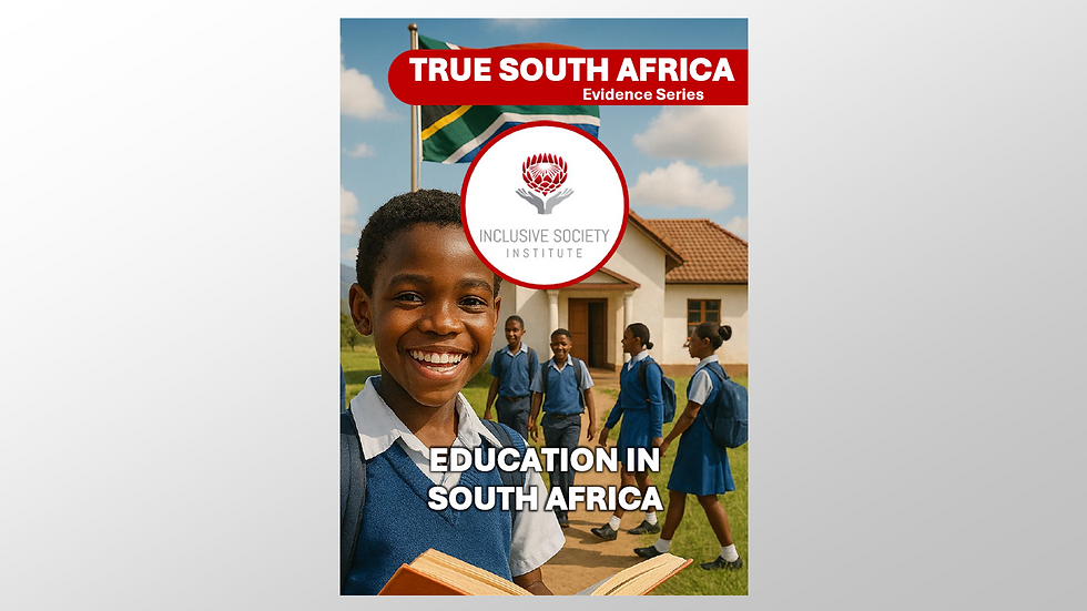
LAPAKBET777LOGIN
ALTERNATIFLAPAKBET
LAPAKBET777DAFTAR
LAPAKBET777OFFICIALL
LAPAKBET777RESMI